13
09/07
12:08
– – – – { courier } – – – –
We live in a world surrounded by fonts. They are there to deliver information. We use and abuse them; we accept or reject them; we ignore, but we need them. Why not let its users know why they are there, how and by whom they were designed. The intention of this project is exactly that, give the daily users an opportunity to rediscover a font that has been following them since their birth and probably will be with them, even after they leave this world.
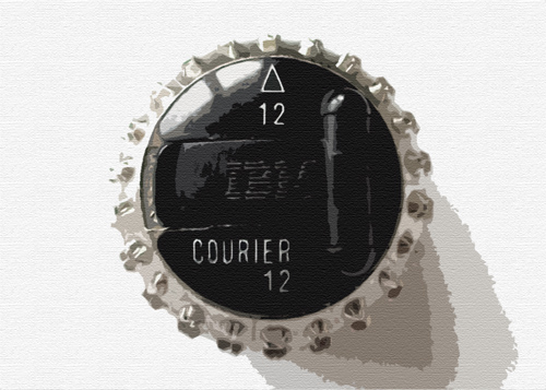
‘Courier’, a font that we have seen in almost all official documents, is the protagonist of this work. Once designed to look modern, progressive and attractive, now has become the font of bureaucracy. To understand the importance and popularity of this font, we need to go back to its creator: Howard G. Kettler.
It was one of my first assignments here in Bremen, in a typography lecture, the previous introduction was written by Antonio De Yta for our final report, below some photo-excerpts from our final report, which can be consulted here in pdf format.
 |
 |
 |
 |
 |
 |
 |
 |
|
 |
 |
 |
Nencia
February 6, 2009
2:38 pm
Great job. Thanks your. 🙂