03
05/16
21:28
Comparisons: eight
| — | ||
| Command | Occurrence | |
| Obedience | Resistance | |
| Magical | Monstrous |
Befehl und Einfall. Kreativ Dialog 4 Konferenz an der BWG interdisciplinary laboratory von der HU-Berlin. 28-30 April 2016.
Compare: Comparisons
03
05/16
21:28
| — | ||
| Command | Occurrence | |
| Obedience | Resistance | |
| Magical | Monstrous |
Befehl und Einfall. Kreativ Dialog 4 Konferenz an der BWG interdisciplinary laboratory von der HU-Berlin. 28-30 April 2016.
Compare: Comparisons
30
06/15
13:00
| Organic | — | Machinic |
| Growth | Fabrication | |
| Hierarchy | Forming | |
| Adaptation | Selection | |
| — | Design | |
| Healing | Replacement |
Schäffner, Wolfgang. Active Matter: 3D code, weaving, folding, and building. Conference at UdK Berlin, Berlin. 26 June 2015 See: Comparisons
03
11/14
10:57
Design of a tool for the visualisation of historical data
Ricardo Cedeño Montaña
Building: Facultad de Arquitectura – Universidad de la República
Room: Salón B2
Date: 14 Nov 2014. 15:00 – 15:20
Last modified: 03 Nov 2014
SIGRADI 2014 programme here (PDF)
ABSTRACT
In the sciences the combination of different types of analysis, textual and visual, contributes to the legibility of the results of the research. Techniques such as data visualization and information graphics have a long history in the natural and social sciences. Recently, researchers in the humanities have got interested in producing visualizations to synthesize facts and trends. The purpose is to create novel observations and analysis of historical and cultural data. This paper presents the use of programming and markup languages to design a custom and open tool for the creation of one particular type of historical data visualization: chronologies.
KEYWORDS: Data visualization, chronology, XML, processing.
PD: The processing sketch is available here: http://bit.ly/1pifGi1
18
03/14
09:31
The noun DIY has got a new subentry in the Oxford English Dictionary: DIYer
DIYer (n.): A person who engages in do-it-yourself activities; an amateur (in construction, repair, etc.).
The OED offers two examples of its use:
- The relentless DIY’er has recorded hundreds of his songs in a makeshift studio in his bedroom, where you can imagine him retreating from a frigid evening.
- A do-it-yourselfer – or DIY’er – is allowed to do everything else, so the great Kiwi tradition of people being able to build their own homes has not been affected, at all.
11
09/10
05:08
Today the production and distribution tools for media have to be free and open. Free and open software have brought a new perception towards these tools. Steadily, we leave pyramidal and individual forms of ownership and production in media to openly share materials, ideas, and procedures in social surfaces without centres. To embrace collaborative forms of production is a breakthrough in media (art, design, and production). Free software allows collective knowledge and aesthetic to surface. These expressions have been largely, neglected by close and feudal tools because they are thought as poor quality. We’ve been conveniently convinced that only the industrial and formal knowledge in media production is proper. This idea has pervaded the media arts and the designs as they remain mainly focused on spectacle and effects.
Knowledge has to run free across the very media. People have to remember how to collaborate if we are to change our world. But digital media are meant to fragment and to be used by mere machine bureaucrats in a state of frenzy consumption. Artists and designers! WE have the duty to denounce and expose this. WE need to defranchise the production of images, narratives, experiences, and objects. WE have to believe it is possible to overcome to supremacy of the bureaucrat system with single ideas and single tasks. WE ought to appropriate these tools before they appropriate us. WE need to fight the self-referential trend of the open media, if WE are to see the variety of the possible. WE need to open art and design and a first step to free art and design.
16
12/08
16:39
HI, in the first chapter of my thesis I wanted to do a special mention to Blahbalicious (1997) by Avatar & Indigo, however right now is somehow not fixing in the text. So I just decided to use this short words here.
This movie was not only of the most awarded of Quake movies but also took skinning and parodying to an upper level. Its directors Avatar & Indigo used in Blabalicious a unique game-character specially designed for this movie (the fat guy). They identified themselves as puppeteers rather than film makers. It is easier to recognise in machinima the techniques and well established conventions of film grammar like camera angles, camera positions and camera movements; particularly because of its output as movies that are shot inside a 3D game engine. However, it is more foggy to identify that in machinima there is no actors, and that what occurs in machinima is rather an extended performance of puppets, a sort of supermarionation [Kelland 2005, p.76].
A machinima maker utilises the game characters or avatars as marionettes. The game models are dressed, made up and their movements controlled externally by the player. Strings are replaced either by keystrokes or scripts and voices are synchronised externally in the same manner is done puppet theatre. This feature permitted Avatar & Indigo a high degree of parody, irreverence and caricaturisation, an aesthetic rarely seen in mainstream animation nowadays.
Here the movie.
27
06/08
13:44
HI, I did picture gallery that due to my hard disk accident I had to re-write, today I want to publish all files as well as a short documentation about this small project, it is quite probable that I continue updating this project in the future, so if you are interested stay tuned to the project web-page:
dRNn photo gallery system’s web-site
I’ve been using this system in my blog to publish and share my picture, you can find some examples of its applicationhere: [new system] and [old system].
Thanks a lot for any comment, suggestion or news about it.
29
01/08
22:32
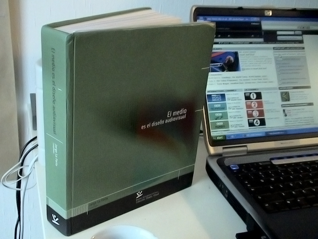
Finalmente y felizmente mi ejemplar del libro: El medio es el diseño audiovisual, llegó!
Aquí un par de fotos del ejemplar, en la segunda está la página en la que se publicó mi artículo: Bit-bang Objeto Digital, que está en la página 57, en el primer capítulo: Diseño, ciencia y artes electrónicas.
El medio es el diseño audiovisual. Jorge La Ferla, Compilador. — Editorial Universidad de Caldas, 2007. 702p.
ISBN: 978-958-8319-05-6
A modo de resumen:
El objetivo del texto es desarrollar una reflexión acerca del objeto, como intención humana, dentro de contextos digitales y las transformaciones que el objeto ha sufrido en su significado, en su manera de ser concebido y las relaciones que establece, dentro de estos contextos, tanto con otros objetos como con las personas; recogiendo para ello las impresiones y teorías de diversos autores en los campos de la filosofía, la estética, la tecnología y el diseño.
Breve reseña histórica:
El artículo vió la luz por primera vez, en la cátedra Manuel Ancizar de la Universidad Nacional de Colombia, en el año 2000. Luego de varias revisiones llegó a la versión que fue publicada en el libro, y ha servido como conferencia en tres oportunidades: las olimpiadas de diseño (Manizales 2004), El festival internacional de la imagen (Manizales 2005), y Diseño con sentido, el mes del diseño (Cali-Palmira 2005).
Un especial agradecimiento a Jorge La Ferla y Felipe Cesar Londoño, por su apoyo.

22
01/08
00:48
September Amsterdam design, the entire city was taken by exhibitions, shows, activities under the scope: design. Fashion, product, graphic, jewellery, accessories, conceptual, etc…
We decided to spend our Saturday (29th) visiting galleries, offices and fairs of this special even. I cannot do a reference of everything we watched there but here I would like to refer to Droog design, probable one of the most interesting and famous design offices in Netherlands and to an exhibition called: Platform 21: folding
Beside its name, Droog was indeed one of the most exciting experiences, I had with design for a long time, their concepts, processes and result make me believe that still exists a hope for design, out of the mainstream and establishment. I would like to highlight and recommend here paying attention to: their actively collaboration with TU Delft on a project call Dry tech. The Knotted Chair by Marcel Wanders is one of the best known designs from the first edition of this project, their concept about our prefab life, and current state-or-the-art in technology, and finally their aesthetic, that combine some sort of irony always by the hand of experimentation. See here a video I found representative of them.
A second aspect that strongly lured me was an exhibition called: Folding, just paper and its aesthetic possibilities on fashion, exciting for it is more than a cloth, rather it is a whole installation based on “fold”. This exhibition was accompanied of interviews and videos of different researchers on this area.Finally my pics. 17 images I’m sure you might enjoy.
13
09/07
12:08

We live in a world surrounded by fonts. They are there to deliver information. We use and abuse them; we accept or reject them; we ignore, but we need them. Why not let its users know why they are there, how and by whom they were designed. The intention of this project is exactly that, give the daily users an opportunity to rediscover a font that has been following them since their birth and probably will be with them, even after they leave this world.
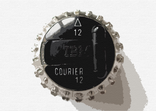
‘Courier’, a font that we have seen in almost all official documents, is the protagonist of this work. Once designed to look modern, progressive and attractive, now has become the font of bureaucracy. To understand the importance and popularity of this font, we need to go back to its creator: Howard G. Kettler.
It was one of my first assignments here in Bremen, in a typography lecture, the previous introduction was written by Antonio De Yta for our final report, below some photo-excerpts from our final report, which can be consulted here in pdf format.
 |
 |
 |
 |
 |
 |
 |
 |
|
 |
 |
 |